When a nonprofit launches a new fundraising drive, a quick visual cue can turn confusion into confidence. A fundraising thermometer—a bar that fills as donations come in—lets both organizers and supporters see progress at a glance. This guide walks curious beginners through the essentials of creating, reading, and leveraging these tools so you can hit targets faster.
What Is a Fundraising Thermometer?
Imagine a glass of water slowly filling up as people pour in. That’s the core idea: a bar, graph, or graphic that tracks live donations against a set goal. The “thermometer” term comes from the way many charts rise like a heated liquid. For nonprofits, the thermometer becomes a dashboard of hope, instantly revealing whether you’re on track or falling short.
Why They Matter for Nonprofits
Fundraising campaigns often start with enthusiasm that fades when progress stalls. A thermometer keeps the momentum alive by turning abstract numbers into a visible path toward the goal. It also encourages peer competition: seeing the bar inch forward can prompt donors to “keep it moving.” For staff, a thermometer offers a real‑time performance indicator, letting teams pivot tactics before deadlines.
How to Build One Step by Step
- Define the goal. Pinpoint a concrete dollar amount or project milestone.
- Choose a platform. Most donation processors—such as Donorbox, GoFundMe, or custom WordPress plugins—provide built‑in thermometer widgets. If you prefer a DIY route, simple CSS and JavaScript can create a live bar.
- Set milestones. Break the goal into chunks (25%, 50%, 75%) to highlight progress stages.
- Design for clarity. Use a contrasting color for the fill and a neutral background for the empty bar. Keep the text legible even on mobile screens.
- Embed and test. Place the thermometer on a prominent spot in your campaign page and run a test donation to confirm live updates.

Reading and Interpreting the Numbers
A thermometer shows more than just the current tally. Notice the rate of fill—fast during launch, slower mid‑campaign, or a sudden surge from a viral share. Compare the fill against time: if you’re 40% of the way through the campaign but only 30% of the goal, the pace is lagging. Adjust outreach accordingly.
Using Thermometers to Motivate Donors
Transparency breeds trust. Share the thermometer on social feeds, email newsletters, and partner sites. A short message like “We’re 70% of the way there—just $3,000 away—give now” turns passive scrolling into action. Pair the visual with a brief narrative: “Every dollar brings the new playground closer to life.”
Common Mistakes and Quick Fixes
- Overloading with data. Keep the display simple—just the bar and a single target. Too many numbers clutter the visual and dilute urgency.
- Failing to update. If the thermometer lags, donors may think the campaign has stalled. Verify your integration and schedule regular updates.
- Ignoring mobile view. A thermometer that shrinks or disappears on phones loses half your audience. Test across devices before launch.
Wrap‑Up & Next Steps
Once you’ve installed a thermometer, treat it like a living metric: monitor its pulse, tweak messaging, and celebrate milestones. The next logical step is to combine the thermometer with a simple donor leaderboard or a “last call” push once you hit a key percentage. Even a modest visual tool can transform how your supporters see, feel, and act on your fundraising story.
British Columbia Curriculum - Education - Teaching The Core

British Columbia curriculum - Education - Teaching the Core ...
SVG > Balloon An Face Woman - Free SVG Image & Icon. | SVG Silh

SVG > balloon an face woman - Free SVG Image & Icon. | SVG Silh
What's So Funny About Peace And Love & Understanding? - Get Real Post
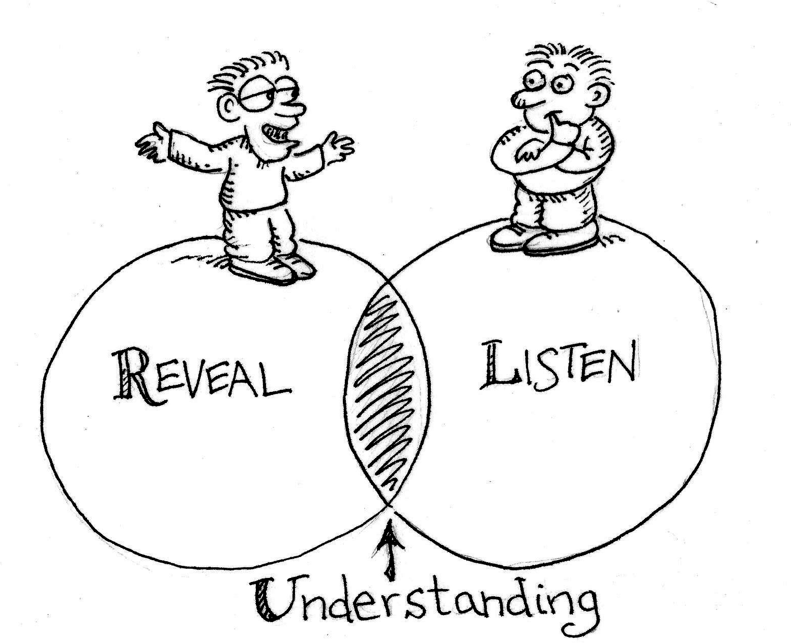
What's So Funny About Peace and Love & Understanding? - Get Real Post
JUANA MORAL'S ENGLISH SITE: ENGLISH GRAMMAR BASICS. 5 TIPS TO

JUANA MORAL'S ENGLISH SITE: ENGLISH GRAMMAR BASICS. 5 TIPS TO ...